Authoring Techniques for Accessible Office Documents: Microsoft Word 2013

Quick Reference
"Curb Cuts"
![]()
This icon highlights "curb cut" opportunities in these techniques. "Curb cuts" are situations in which accommodations made for accessibility reasons will also result in significantly better and more efficient outcomes for everyone. The name comes from sidewalk "curb cuts" that were added for people in wheelchairs, but are commonly used by people with baby strollers, handcarts, wheeled luggage, and others.
Technique 1. Use Accessible Templates
WCAG 2.0 Applicability:
- All success criteria
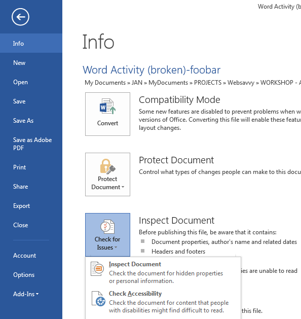
All office documents start with a template. These can be as simple as a blank standard-sized page or complex nearly-complete document with text, graphics and other content (e.g. a "Meeting Minutes" template). Because templates provide the starting-point for so many documents, accessibility is critical. If you are unsure whether a template is accessible, you should check a sample document produced when the template is used (see Technique 10. Check Accessibility).
Word 2013’s default template for new documents is a blank page. The basic installation also includes a variety of other blank office-related documents. These are all accessible by virtue of being blank. It is also possible to create your own accessible templates.
![]() Curb Cuts: Updating templates is also a good opportunity to improve document consistency, copy-editing, and branding.
Curb Cuts: Updating templates is also a good opportunity to improve document consistency, copy-editing, and branding.
To create an accessible template:
- Create a new document (from the default blank template or from one of the prepackaged templates)
- Ensure that you follow all of the techniques in this document
- When you are finished, check the accessibility of the document (see Technique 10. Check Accessibility)
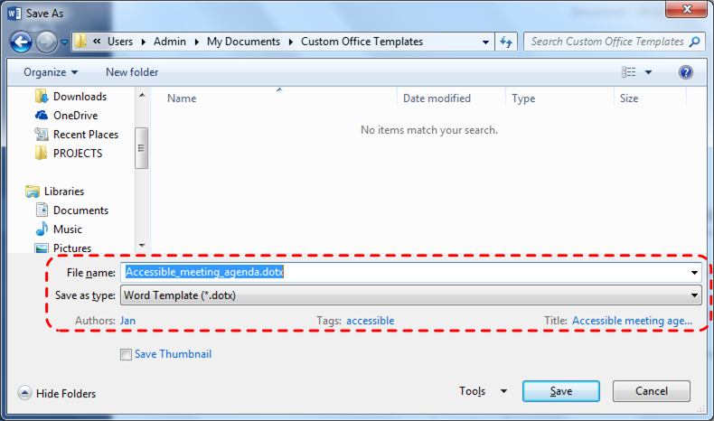
- Go to menu item: File > Save As
- Select Templates
- In the Save as type list, select Word Template (*.dotx)
- In the File name box, type a name for the template. Using a descriptive File name (e.g. "Accessible Memo Template") may increase the prominence of the accessibility status. As well, filling in the text boxes labeled Tags and Title with the terms that include "accessibility" may improve the discoverability of the template as an accessible file.
- Select Save
To select an accessible template:
Only use these steps if you have an accessible template available (e.g. that you previously saved). Otherwise, simply open a new (blank) document.
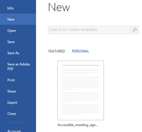
- Go to menu item: File > New
- Select Personal
- Select your accessible template from the list
- A new document based on the template will be displayed. If you have chosen an accessible template, the document will be accessible at this point.
- As you add your content (e.g. text, images, etc.), ensure that you consult the sections that follow to preserve accessibility.
Technique 2. Specify Document Language
WCAG 2.0 Applicability:
- 3.1.1 Language of Page
- 3.1.2 Language of Parts
In order for assistive technologies (e.g. screen readers) to be able to present your document accurately, you must indicate the natural (human) language of the document. If a different natural language is used for a paragraph or selected text, this also needs to be clearly indicated.
![]() Curb Cuts: The specified document language is also used by the spelling and grammar checker. In Canada, make sure to choose "English(Canada)" to avoid having to over-ride American spellings of words such as "colour".
Curb Cuts: The specified document language is also used by the spelling and grammar checker. In Canada, make sure to choose "English(Canada)" to avoid having to over-ride American spellings of words such as "colour".
To change the default language:
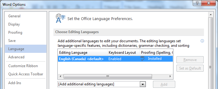
- Go to menu item: File
- Select Options from the list in the left window pane
- Select Language from the list in the left of the Options dialog
- Under Choose Editing Languages, select the editing language you want to use
Note: to add an editing language, select the language from the drop down list labeled [Add additional editing languages] - Select Set as Default
- Close all Office 2013 documents and open them again for the changes to take effect
Word 2013 has an automatic language detection mechanism, which can automatically detect the language of your text. If you type a section of text in a different language than the rest of your document, Word 2013 should programmatically mark the language of that section of text appropriately.
To turn on automatic language detection:
- Go to menu item: Review
- In the Language section, select the Language button
- Select Set Proofing Language
- In the Language dialog, select the Detect language automatically check box
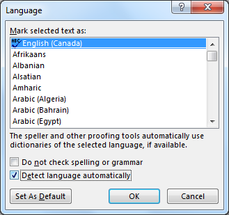
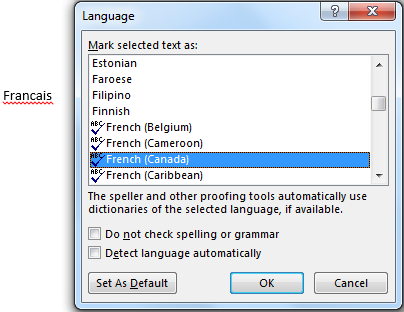
To apply a language directly to selected text:
- Select the text
- Go to menu item: Review
- In the Language section, select the Language button
- Select Set Proofing Language
- In the Mark selected text as box, select the language from the list
- Select OK
Technique 3. Provide Text Alternatives for Images and Graphical Objects
WCAG 2.0 Applicability:
- 1.1.1 Non-text Content
When using images or other graphical objects, such as charts and graphs, it is important to ensure that the information you intend to convey by the image is also conveyed to people who cannot see the image. This is done by adding concise alternative text to of each image. If an image is too complicated to concisely describe in the alternative text alone (e.g. artwork, flowcharts, etc.), provide a short text alternative and a longer description as well.
![]() Curb Cuts: Sometimes it may not be clear what a particular image is meant to convey and alternative text can provide that clarity. Also, alternate text has been shown to be included in search engines rankings.
Curb Cuts: Sometimes it may not be clear what a particular image is meant to convey and alternative text can provide that clarity. Also, alternate text has been shown to be included in search engines rankings.
Tips for writing alternative text
- Try to answer the question "what information is the image conveying?".
- If the image does not convey any useful information, leave the alternative text blank.
- If the image contains meaningful text, include all of the text in the alternative.
- Alternative text should be fairly short, usually a sentence or less and rarely more than two sentences.
- If more description is required (e.g. for a chart or graph), provide a short description in the alternative text (e.g. a summary of the trend) and more detail in the long description, see below.
- Test by having others review the document with the images replaced by the alternative text.
Tips for writing longer descriptions
- Long descriptions should be used when text alternatives (see above) are insufficient to answer the question "what information is the image conveying?".
- In some situations, the information being conveyed will be how an image looks (e.g. an artwork, architectural detail, etc.). In these cases, try to describe the image without making too many of your own assumptions.
- One approach is to imagine you are describing the image to a person over the phone.
- Ensure that you still provide concise alternative text to help readers decide if they are interested in the longer description.
Alternatively, you can include the same information conveyed by the image within the body of the document, providing the images as an alternate to the text. In that case, you do not have to provide alternate text within the image.
To add alternative text to images and graphical objects:
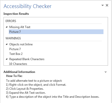
- Right-click* the object
- Select Format Picture…
- Select the Layout & Properties tab
- Select the Alt Text option from the list under that tab
- Fill in the Description field (not the "Title" field)
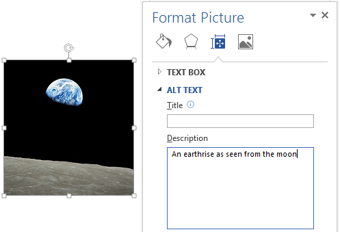
When inserting a very small image (or resizing a larger image to be much smaller) and following it with text, Word 2013 sometimes assumes that the image is intended to be a bullet-point for a bulleted list. Once Word 2013 defines the image as a bullet, the option to add alternative text disappears. Select Undo, to redefine the bullet as an image.
Technique 4. Avoid "Floating" Elements
WCAG 2.0 Applicability:
- 1.3.2 Meaningful Sequence
When certain elements (e.g. images, objects, text boxes) are inserted into Word 2013 documents they default to being an "inline object". Inline objects keep their position on the page relative to a position in the text. This is beneficial for users of assistive technologies (e.g. screen readers), because the position of the object in the document order is clear, so the screen reader can read the object's alternative content (e.g. Description field) when the user moves keyboard focus to that position.
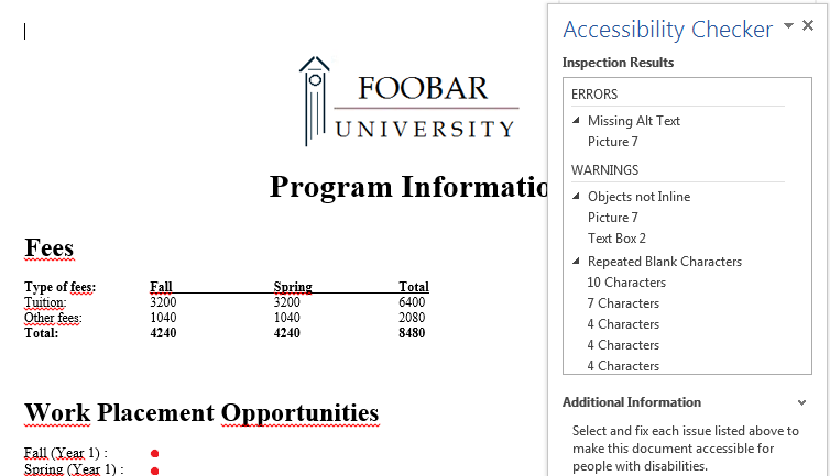
However, Word 2013 also provides the option to have these elements "float" outside of the text order, with text flowing around, under or over it. This is a problem because the position of the object in the document is no longer clear and the screen reader will often read the alternative text out of context, which can be confusing. These text flow options should be avoided.
Similarly, avoid placing drawing objects such as arrows, lines and shapes directly into the document (e.g. as borders, to create a diagram). Instead, create borders with page layout tools and insert complete graphical objects (e.g. pictures).
![]() Curb Cuts: In-line elements are often easier to work with than floating elements, which can end up being shifted into strange positions as editing earlier parts of a document cause re-pagination.
Curb Cuts: In-line elements are often easier to work with than floating elements, which can end up being shifted into strange positions as editing earlier parts of a document cause re-pagination.
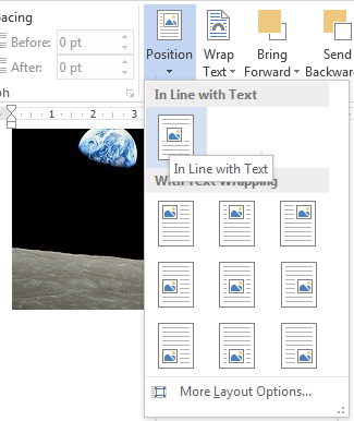
To prevent an image or object from "floating":
- Select the object
- Go to menu item: Page Layout
- Select Position from the Arrange section
- Select In Line with Text
Technique 5. Use Headings
WCAG 2.0 Applicability:
- 1.3.1 Info and Relationships
- 2.4.1 Bypass Blocks
- 2.4.6 Headings and Labels
- 2.4.10 Section Headings
Any documents that are longer than a few paragraphs require structuring to make them easier for readers to understand. One of the simplest ways to do this is to use "True Headings" to create logical divisions between paragraphs. True headings are more than just bolded, enlarged, or centered text; they are structural elements that order and levels provide a meaningful sequence to users of assistive technologies.
![]() Curb Cuts: Using true headings provides several important benefits: (1) Headings are used by Word 2013 to auto-generate a table of contents (see Technique 6.5 Use a Table of Contents); (2) Headings are used by the "Navigation Pane" which is especially helpful for long documents (see Word 2013’s "Navigation" Feature); and you can update all of the headings of a particular type at once, which keeps them consistent.
Curb Cuts: Using true headings provides several important benefits: (1) Headings are used by Word 2013 to auto-generate a table of contents (see Technique 6.5 Use a Table of Contents); (2) Headings are used by the "Navigation Pane" which is especially helpful for long documents (see Word 2013’s "Navigation" Feature); and you can update all of the headings of a particular type at once, which keeps them consistent.
Tips for headings
- Use the default headings styles provided ("Heading ", "Heading 2", ..., "Heading 9")
- Nine levels of headings are supported.
- Nest headings properly (e.g. the sub-headings of a "Heading 1" are "Heading 2", etc.)
- If you plan to create a Word document that will have an automatically generated table of contents, remember that text marked with "Heading 1" will appear in the table of contents. Threfore, you may want to mark the top-level title of the document, which typically wouldn't be included in the document's table of contents, with the "Title" style. On the other hand, if you plan to convert to HTML, the main title is usually marked with a "Heading 1" which will be mapped to an <h1> HTML element.
To apply headings to selected text:
- Select text
- Right-click* and select Styles
- Select the heading style (Heading 1, Heading 2, etc.) from the list
To apply headings using the Styles toolbar
- Select text
- Go to menu item: Home
- In the Styles section, select the heading style that you wish to apply
Note: You can scroll through the multiple heading styles using the arrows on the right side of the Styles section. You can also change the Style design by selecting the Change Styles button on the right.
To modify heading styles:
- Go to menu item: Home
- In the Styles section, right-click* the style you wish to modify from the Styles Gallery
- Select Modify
- In the Modify Style dialog, make your desired changes to style characteristics
- Select OK
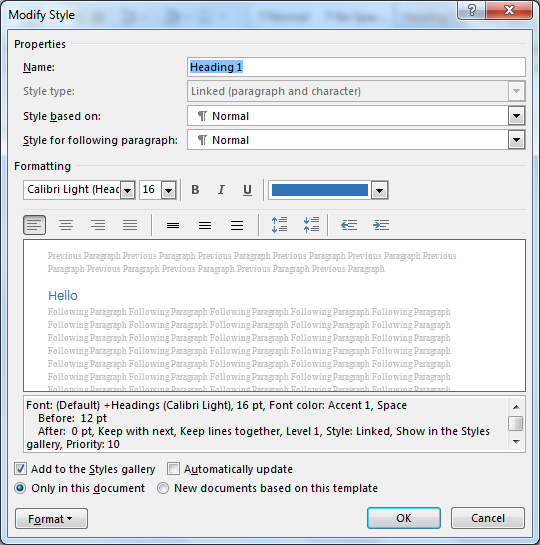
Adding heading style that is not listed:
Sometimes heading levels may not appear in lists described above. For example, the list might contain "Heading 1" and "Heading 2", but not "Heading 3". In this case, it is still possible to apply the unlisted style:
- Select text
- Go to menu item: Home
- In the Styles section, select the arrow to expand the list of style options.
- Select Apply Styles
- In the Style Name, enter the heading style ("Heading 1" to "Heading 9")
- Select Apply button
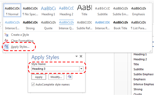
Technique 6. Use Built-In Document Structuring Features
WCAG 2.0 Applicability:
- 1.3.1 Info and Relationships
- 1.3.2 Meaningful Sequence
- 2.4.2 Page Titled
![]() Curb Cuts: Using built-in structural features is much more reliable that trying to use typography for formatting (e.g. tabs to separate table cells, repeated new lines for a page break).
Curb Cuts: Using built-in structural features is much more reliable that trying to use typography for formatting (e.g. tabs to separate table cells, repeated new lines for a page break).
6.1 Tables
When using tables, it is important to ensure that they are clear and appropriately structured. This helps all users to better understand the information in the table and allows assistive technologies (e.g. screen readers) to provide context so that the information within the table can be conveyed in a meaningful way.
Tips for tables:
- Only use tables for tabular information, not for formatting, such as to position columns.
- Use "real tables" rather than text formatted to look like tables using the TAB key or space bar. These will not be recognized by assistive technology.
- Keep tables simple by avoiding merged cells and dividing complex data sets into separate smaller tables, where possible.
- If tables split across pages, set the header to show at the top of each page. Also set the table to break between rows instead of in the middle of rows.
- Create a text summary of the essential table contents. Any abbreviations used should be explained in the summary.
- Table captions or descriptions should answer the question "what is the table's purpose and how is it organized?" (e.g. "A sample order form with separate columns for the item name, price and quantity").
- Table cells should be marked as table headers when they serve as labels to help interpret the other cells in the table.
- Table header cell labels should be concise and clear.
- Ensure the table is not "floating" on the page (see Technique 4. Avoid "Floating" Elements).
To insert a table:
- Go to menu item: Insert
- In the Tables section, select Insert Table
- Select the Number of coumns and the Number of rows you would like your table to have
- Select the OK button
To a heading row:
- Place the cursor in the top-row of the table that you would like to make into the heading row.
- The Table Tools menu item should appear
- Go to menu item: Table Tools > Layout
- In the Table section, select Properties
- Select the Row tab
- Select the Repeat as header row at the top of each page checkbox.
6.2. Lists
When you create lists, it is important to format them as "real lists". Otherwise, assistive technologies will interpret your list as a series of short separate paragraphs instead of a coherent list of related items.
To create an ordered or unordered list:
- Go to menu item: Home
- In the Paragraph section, select the Bullets icon for unordered lists or select the Numbering icon for ordered lists
To modify list styles:
- Go to menu item: Home
- In the Paragraph section, select the arrow beside the Bullets icon for unordered lists or select the arrow beside the Numbering icon for ordered lists
- Select Define New Bullet… to create a new unordered list format
- Select Define New Number Format… to create a new ordered list format
- In the New Bullet dialog or the New Number Format dialog, select the list characteristics
- Select OK
6.3 Columns
Use the Columns feature for placing text in columns.
Note: Because columns can be a challenge for some users with disabilities (e.g. people using magnifiers), consider whether a column layout is really necessary.
6.4 Page Breaks
Start a new page by inserting a page break instead of repeated hard returns.
To add a page break:
- Go to menu item: Page Layout
- In the Page Setup section, select the arrow beside the Breaks icon.
- Select the type of break to add. Page break is used to start a new page with the same page layout (page orientation, headers, page numbering, etc.). Section break is used if you want to start a new section of the document with a differing page layout.
6.5 Table of Contents
Creating an index or table of contents to outline office document content can provide a means of navigating the meaningful sequence of content.
The best way to generate a table of contents is after applying the predefined heading styles (e.g. "Heading 1", "Heading 2", "Heading 3") as described above, to the headings that you want to include in your table of contents. After you apply these styles, you can then create a table of contents.
Note: If you do not want the main title of the document to appear in the generated table of contents, mark it with the "Title" style.
To insert a table of contents:
- Place the cursor in your document where you want to create the table of contents
- Go to menu item: References
- In the Table of Contents section, select Table of Contents
- Select the style that you want to use
To update a table of contents:
- Select the table of contents
- Go to menu item: References
- In the Table of Contents section, select the Update Table button
6.6 Page Numbering
Numbering the pages of you document helps those reading and editing your document effectively navigate and reference its content. For users of assistive technologies, it can provide a valuable point of reference within the document.
To insert page numbers:
- Go to menu item: Insert
- In the Header & Footer section, select Page Number
- Select where you would like to insert your page numbers
- Select the style of page number you would like to use
To format page numbers:
- Go to menu item: Insert
- In the Header & Footer section, select Page Number
- Select Format Page Numbers…
- In the Page Number Format dialog, select the page format characteristics you would like to use
Note: These changes are applied to the predefined page format styles. It does not create a new page format style.
6.7 Document Title
If you plan to convert the document into HTML, it should be given a descriptive and meaningful title.
To change the title of the current document:
- Go to menu item: File
- Select Info from the list in the left window pane
- In the right window pane, select the Title textbox and enter an appropriate title
Note: The Title defined in the properties is different than the file name.
Technique 7. Create Accessible Charts
WCAG 2.0 Applicability:
- 1.1.1 Non-text Content
- 1.3.1 Info and Relationships
Charts can be used to make data more understandable for some audiences. However, it is important to ensure that your chart is as accessible as possible to all members of your audience.
- All the basic accessibility considerations that are applied to the rest of your document must also be applied to your charts and the elements within your charts. For example, use shape and color, rather than color alone, to convey information.
- When creating line charts, use the formatting options to create different types of dotted lines to facilitate legibility for users who are color blind.
- When creating bar charts, it is helpful to apply textures rather than colors to differentiate the bars
- Ensure that the contents are your chart are appropriate labeled to give users reference points that will help them to correctly interpret the information.
- Use the formatting options to change predefined colors, ensuring that they align with sufficient contrast requirements (see Technique 8.2 Use Sufficient Contrast)
- Consider providing the data that you used to create the chart in tabular form (e.g. as an appendix).
![]() Curb Cuts: If the chart data is also provided in an appendix, it will be easier for all users to make use of the data.
Curb Cuts: If the chart data is also provided in an appendix, it will be easier for all users to make use of the data.
Technique 8. Make Content Easier to See
WCAG 2.0 Applicability:
- 1.3.3 Sensory Characteristics
- 1.4.1 Use of Color
- 1.4.3 Contrast (Minimum)
- 1.4.5 Images of Text
- 2.2.2 Pause, Stop, Hide
![]() Curb Cuts: All users will benefit from content that is easier to see.
Curb Cuts: All users will benefit from content that is easier to see.
8.1 Format of Text
When formatting text, especially when the text is likely to printed, try to:
- Use font sizes between 12 and 18 points for body text.
- Use fonts of normal weight, rather than bold or light weight fonts. If you do choose to use bold fonts for emphasis, use them sparingly.
- Use standard fonts with clear spacing and easily recognized upper and lower case characters. Sans serif fonts (e.g. Arial, Verdana) are typically easier to read than serif fonts (e.g. Times New Roman, Garamond).
- Avoid large amounts of text set all in caps, italic or underlined.
- Use normal or expanded character spacing, rather than condensed spacing.
- Avoid animated or scrolling text.
But can’t users just zoom in? Office applications do typically include accessibility features such as the ability to magnify documents and support for high contrast modes. However, because printing is an important aspect of many workflows and changing font sizes directly will change documents details such as the pagination, the layout of tables, etc., it is best practice to always format text for a reasonable default level of accessibility.
To change the text size for a default named style:
- Go to menu item: Home
- In the Styles section, right-click* the Style you wish to modify
- Select Modify Style
- Under Formatting in the Modify dialog box, select the appropriate font size
- Exit with OK

8.2 Use Sufficient Contrast
The visual presentation of text and images of text should have a contrast ration of at least 4.5:1. To help you determine the contrast, here are some examples on a white background:
- Very good contrast (Foreground=black, Background=white, Ratio=21:1)
- Acceptable contrast (Foreground=#767676, Background=white, Ratio=4.54:1)
- Unacceptable contrast (Foreground=#AAAAAA, Background=white, Ratio=2.32:1)
Also, always use a single solid color for a text background rather than a pattern.
In order to determine whether the colors in your document have sufficient contrast, you can consult an online contrast checker, such as the TPG Contrast Analyser.
8.3 Avoid Relying on Color or Sensory Characteristics
The instructions provided for understanding and operating content should not rely solely on sensory characteristics such as the color or shape of content elements. Here are two examples:
- Do not track changes by simply changing the color of text you have edited and noting the color. Instead use Word 2013’s "Track Changes" feature to track changes.
- Do not distinguish between images by referring to their appearance (e.g. "the bigger one"). Instead, label each image with a figure number and use that for references.
8.4 Avoid Using Images of Text
Before you use an image to control the presentation of text (e.g. to ensure a certain font or color combination), consider whether you can achieve the same result by styling "real text". If this is not possible, as with logos containing stylized text, make sure to provide alternative text for the image following the techniques noted above.
Technique 9. Make Content Easier to Understand
WCAG 2.0 Applicability:
- 2.4.4 Link Purpose (In Context)
- 3.1.4 Abbreviations
- 3.1.5 Reading Level
- 3.2.3 Consistent Navigation
- 3.2.4 Consistent Identification
